GiMP University Logo (1)
You saw some of my handiwork in a previous entry in which, I admit, I sorta violated the rules of tutorials by serving up examples of stuff that you can't really make with the tool you're allegedly demonstrating. Well, I'm about to upgrade this site with something a little more snappy than the generic "new blogger" template I'm forcing you to look at here in the beginnings of GiMP university, but to do that I need a "GiMP University" logo that doesn't make me cry when I look at it.
(BTW, one of the most frequently used search terms that get people here is "gimp make logo", so this will be one set of lessons which, apparently, people are actually looking for.)
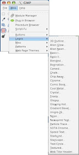
Now, you would think that all we would have to do is go to the "Tools" dialog, drop down the "Xtns" menu, select "Logos", and choose a logo style to make our work simple and complete.
In fact, I recommend as independent study time you doing just that with the phrase "GiMP UNIVERSITY", and if you make something you're especially proud of, e-mail me a link and I'll link it here for the readers of GiMP-U to see and heckle or praise (as they are so lead).
I don't want to surprise you or anything, but making a logo is not a one-step process. And while I want you to really sort of contemplate that, I don't want to give you 6 transferable hours in Identity Marketing. What I want you to remember, however, is that a logo is like the face of whatever endeavor you're making it for. In that, it has to make a first impression, it has to win friends and influence enemies, and it has to be memorable and expressive, but not clownish.
And the first step in making a logo is thinking about type face. As we go there, keep in mind that your slithery little collection of system fonts that came with your computer is not even nearly enough interesting typography to really get rolling. Visit any of the font sites in the sidebar to get you some really cool fonts as soon as possible. (They don't pay me to say that, either)
Now, look at this image:
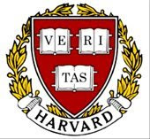
It is mostly not the font -- it's mostly a big red shield with a yellow wreath around it, but notice that the word "VERITAS" and the word "HARVARD" have at least two things in common:
[1] You can read them easily.
[2] The font is not more important than the actual institution.
Here's what I mean by [2]: When they designed this seal (this isn't the original seal, btw, even though it includes the original seal; it's very clever), they realized that what makes the logo important is the centuries-long tradition of Harvard. They didn't try to overpower more than 200 years of achievement with some 800-lb gorilla font. The seal needed to say "HARVARD". They could have done that like this:
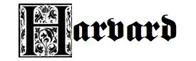
Which would instead say, "scary gothic castle erected around HARVARD which is very important". And while in one sense they may mean that, (they don't take everyone, do they?) what they mean with the font the chose is something less ostentatious.
Now, my idea here is to build a GiMP University logo which, frankly, knocks off the HARVARD logo so that our logo implies to the observer, "we're the Ivy League tutorial for GiMP users". And to do that, I'm going to pick this font, which is called "Admisi Display":

See? You can read it right away, it keeps that nutty design element for the GiMP startup screen text where the "i" is lower case and the other letters are not (yes, you can fight with me about the "G"), and it doesn't complicate the rest of our work by employing a font around which the rest of the seal has to somehow conform itself.
This is completely entry-level stuff, I admit it. But GiMP university is not for snobs. It's for people trying to improve their graphics savvy, and sometimes you have to start with something as ridiculous as font selection to get anywhere at all.
More later.
(BTW, one of the most frequently used search terms that get people here is "gimp make logo", so this will be one set of lessons which, apparently, people are actually looking for.)
Now, you would think that all we would have to do is go to the "Tools" dialog, drop down the "Xtns" menu, select "Logos", and choose a logo style to make our work simple and complete.

In fact, I recommend as independent study time you doing just that with the phrase "GiMP UNIVERSITY", and if you make something you're especially proud of, e-mail me a link and I'll link it here for the readers of GiMP-U to see and heckle or praise (as they are so lead).
I don't want to surprise you or anything, but making a logo is not a one-step process. And while I want you to really sort of contemplate that, I don't want to give you 6 transferable hours in Identity Marketing. What I want you to remember, however, is that a logo is like the face of whatever endeavor you're making it for. In that, it has to make a first impression, it has to win friends and influence enemies, and it has to be memorable and expressive, but not clownish.
And the first step in making a logo is thinking about type face. As we go there, keep in mind that your slithery little collection of system fonts that came with your computer is not even nearly enough interesting typography to really get rolling. Visit any of the font sites in the sidebar to get you some really cool fonts as soon as possible. (They don't pay me to say that, either)
Now, look at this image:
It is mostly not the font -- it's mostly a big red shield with a yellow wreath around it, but notice that the word "VERITAS" and the word "HARVARD" have at least two things in common:
[1] You can read them easily.
[2] The font is not more important than the actual institution.
Here's what I mean by [2]: When they designed this seal (this isn't the original seal, btw, even though it includes the original seal; it's very clever), they realized that what makes the logo important is the centuries-long tradition of Harvard. They didn't try to overpower more than 200 years of achievement with some 800-lb gorilla font. The seal needed to say "HARVARD". They could have done that like this:

Which would instead say, "scary gothic castle erected around HARVARD which is very important". And while in one sense they may mean that, (they don't take everyone, do they?) what they mean with the font the chose is something less ostentatious.
Now, my idea here is to build a GiMP University logo which, frankly, knocks off the HARVARD logo so that our logo implies to the observer, "we're the Ivy League tutorial for GiMP users". And to do that, I'm going to pick this font, which is called "Admisi Display":

See? You can read it right away, it keeps that nutty design element for the GiMP startup screen text where the "i" is lower case and the other letters are not (yes, you can fight with me about the "G"), and it doesn't complicate the rest of our work by employing a font around which the rest of the seal has to somehow conform itself.
This is completely entry-level stuff, I admit it. But GiMP university is not for snobs. It's for people trying to improve their graphics savvy, and sometimes you have to start with something as ridiculous as font selection to get anywhere at all.
More later.
