Perspective and Layers
Yeah, shoot. there are three broken image links in this post, so forgive me as you read it. I will fix them later today -- I don't know what happened.
Well. Now that some of you have found this blog via my normal blog, we can get on with the festivities. Last time we thought about what it would take to remove an object in the foreground of some image so we could use it in another image like this:
And those who were with us last time are thinking, "hmph. Cent changed the logo on the 'flat surface' from last time." Yeah, well, I'm working on the PC at the bookstore tonight to try to give equal time to the win-heads, and I left one of my files at home rather than putting it on my flash drive, so I had to find another somewhat-suitable substitute for our work today.
But, because I'm that kind of guy, I'm going to upload all the files you will need right here, and you can download them yourself so you can work through the rest of this little exercise with me.
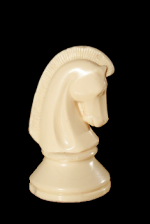
Here's the masked-off chess knight:

Here's the logo we'll be using for today's work:

And your first job is to open the GiMP, and create a sandbox image that's 500x500 pixels with a white background like this one:
Now, to build our target image, you need to flip the knight so that it's facing left instead of right. This should be easy enough if you've ever used Paint, and it's easy in the GiMP - you just have to know where to find the darned options. Look here:
And notice that GiMP is kind enough not to make you try to figure out if "Horizontal flip" means "flip on the H axis, meaning top-to-bottom" or "flip across the H axis, meaning left-to-right" - it gives you an icon so you know that if you want to flip left-to-right, you click that arrow. If you're easily-confused like me, this is a good feature. So flip the knight, and go back to your sandbox image.
Now, to make this whole exercise work, we are going to have to leverage layers pretty heavily, so stay with me. In the sandbox image:
go to your "Layers" dialog
click the "New Layer" button so you get the "New Layer" dialog
select the "transparent" radio button so the layer has completely empty
and name the layer "knight".
Before you click "OK", make sure the dialog box looks like this:
Now go back to the knight image, and use the magic wand trick we used there to select the image out of the black background:
set the wand to a threshold of "20"
select the black
invert the selection
shrink the selection by 2 pixels
feather the selection by 4 pixels
and copy.
Now breathe deeply. You're doing fine.
OK - we want to paste the knight into the sandbox image, so select the sandbox image and then do the following:
Select the "knight" layer
Paste the knight from the clipboard
Click the "anchor" button in the "Layers" dialog.
And when you're done, the sandbox image will look like this:
and your layers dialog will look like this:
Now, honestly, that's the hardest part of this exercise. The rest of this is ridiculously easy, and you're going to hate it that I had to teach it to you.
Use the "New Layer" button to add a new layer to the sandbox, and name that layer "logo". Make sure you make is a transparent layer. Now open the logo image I gave to you, above, and see if you can figure out, using the Magic Wand, how to select it so you can use it for our project.
Any ideas?
Yes, that's right:
Select the white part on the outside of the logo
Invert the selection
Expand your selection by 3 pixels (no need to feather)
And copy.
Then you move to the sandbox image and:
Select the "logo" layer
And Paste the logo. (DO NOT anchor the image to the layer yet!)
Now, we have to make that logo look like it is printed on the flat surface under the knight, which poses two very interesting problems for us:
[1] how do we get the logo under the knight?
[2] how do we create the optical illusion that the logo is on a surface under the knight?
Let's solve these problems in reverse order. But to do this right, we need to see more of this object than we see right now, so select the floating selection in the Layers dialog, and make its transparency 66% so you can see the knight behind it. Cool, huh?
Now move the logo so its bottom lines up with the bottom of the knight, like so:
Now, we're going to use a new tool, surprisingly, called the "Perspective Tool", which looks like this:
And what you're going to do with it is click on the logo so you get something like this in your sandbox image:
Now, before we tinker with the perspective tool, let's talk about what putting an object into "perspective" means - this is Art School geek speak, so get a glass of water or something and think about this - because I'm trying not to geek you too often or too hard, but this is really, really important.
Look at this image:
As the chess board in this image extends away from the camera, the furthest border of the board looks like it's actually narrower than the closest edge of the board - the board looks like it tapers in! But what is actually happening here is what happens any time we look at something: things farther away look smaller, and all parallel lines running toward the horizon appear to meet in what is called the "vanishing point".
This applies to us in this exercise in this way: we have to make the logo look like it's lying flat on a surface parallel to the bottom of the knight so that its perspective matches the perspective of the base of the chess piece.
And that, unfortunately, requires some art rather than science. You manipulate the perspective box by clicking and dragging the corners. Here's what I did to the corners of the logo to make my logo look flat:
Notice that I have shortened the image in the same way the chess board up above looks like it's shorter than it is wide, and I have narrowed the top edge to make it look like it's farther away. Those who are really observant will notice that the pitch of the perspective on the right is not as steep as it is on the left - and that's because the logo doesn't sit dead-center under the knight. Once you have done the deed to your logo in your sandbox, hit "enter".
Now if you're a perfectionist, you could click the logo with the perspective tool again and tweek it out -- my opinion is that it is not yet perfect, but it's close enough for our exercise. The rest of us are going to adjust the transparency back to 100% and then click the anchor button so the logo sinks into the "logo" layer, thus:
And your "Layers" dialog looks like this:
Now, that's not right, is it? The logo has to go under the knight - which was out problem #1. Well, that's why we're using layers. Simply select the "logo" layer in the "Layers" dialog, and drag it so that it is stacked under the "knight" later - like this:
And your sandbox image looks like this:
And you can then drag the layers around so that they look like this:
Now, the last part is the really the ridiculously-simplest part - which is causing the knight to have a rightly-positioned shadow. But here's the thing: we have to use a new tool to do it, and I'm out of time today.
You try to figure it out, and I'll be by later this week to show you how I'd do it.
