The Magic Wand
OK: we have covered the really no-brainer tools in the tool set, but as we said, those tools aren't really all that better than the one you get with MS Paint. How do I go about building or designing really cool images like this one:
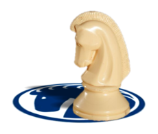
See: this image has 4 components -- the white background, the foreshortened logo which looks like it's laying flat on a surface, the shadow over the logo but under the knight, and the knight itself. And to make an image like this from other images, you have to be able to select areas of an image in ways a little more, um, artistic than merely using the rectangle-select tool.
That's where the magic wand (or, as the GiMP calls it, the "fuzzy select") tool comes in. But before we talk about the tool, let's all get the same base image to work with. The image below was downloaded from wikimedia.org, and falls under the wikimedia license for wikimedia images:

This is also the image I used to nab the knight for the image we looked at, above. But how did I peel it off the photo without, for example, picking up any of the grain of the chess board?
Well, let's open it in the GiMP and find out.

In that snapshot of my desktop (I'm using my Mac laptop), you can see that I have selected the wand tool, and I have the tool options open so we can sort of skip over the basics.
Now -- without changing any of the tool's setting, click someplace on the cheekbone of the knight's head. You should get something like this:

That's sorta weird, huh? You got a lot of area that's surrounded by the "marching ants", but not all of of the picture was selected. What the magic wand does is select an area of all the pixels in an image which meet the following criteria:
[1] they all touch each other
[2] they all fall inside the same color threshold as the first pixel you selected
Now, what does that mean? Take a look at your tool options for a second and notice that there's a slider there marked "Threshold". That slider (and the numbers next to it) indicate a degree of difference between the base pixel you select from and the most-different pixel color the tool will select. If you slide the slider all the way to the right, you will find that the highest value for the tool -- the highest level of threshold -- is "255", which is really an uber-geek notation for "make no distinctions -- include everything". At the risk of boring you to death, they use that number and not a sliding percent of threshold because 255 equals the largest number you can represent in an 8-bit number. The irony, really, is that this value is not an integer, so it's not really an 8-but number, so they could have used percentage and not confused the track ball off of normal people, but (yawn) I can see that I am boring you with geek-speak.
Anyway, in simple image -- like the one we made on the first lesson -- the magic wand can be set at a certain threshold and simply select objects that are more or less a uniform color, and you can suck them right out of their context. But we have a problem with the chess piece: this image has a really consistent color pallet. That is: there are a lot of colors that are really close to each other in threshold. To see what I mean, set your threshold to "75" and select the horse's cheek again. You get something like this:

Now, that looks pretty good, right? Most of the knight is selected. The problem is that not all of it was selected -- look at the base, and under the chin, and where his eye would be, and in the crest of his mane -- these are dark areas which are as dark as the chess board which are outside the current threshold. But worse for us is on the left at the bottom of the piece where the threshold of the background is low enough that the places it touches the object we are trying to select cause the tools to select the background. If we raise the threshold any higher, we're going to get a lot of stuff we don't want, and we won't be any better off than we are right now.
See: it seems pretty obvious that we should try select the object in the foreground because it is a consistent color -- it should be the easiest to select because it is all nearly the same color. But it turns out that it's not consistent enough, so we're going to select the background instead, using a function of this tool called "add to the current selection".
Set the tool threshold to "20", which is pretty aggressive but not so much that we can't make fine distinctions in the image. Then go back to the image, and type SHIFT-CTRL-A, which will select none of the image. Now point your magic wand at some part of the black area of the image at the top and click it. You'll get something like this:

That makes a selection of all the darkest parts except that object that's in the background there that makes a light spot. To fix that -- that is, to add it to the selection -- hold down your SHIFT key and click the light-colored spot. It'll select the middle of the light area because the range of the colors in this area is greater than the threshold of our tool. If you do that a second time in the donut ring that's left, it will add that to the selection as well, like this:

Now, that seems really cool until we get to the hard parts in the chess board. Because when we SHIFT-select a spot below the black areas, we get something like this:

What that's really going to take is a little patience and some repeated application of the SHIFT-select technique as you find areas of high contrast that don't allow you to make quick work of it like we did at the top of the image.
One really valuable tip, however, is that if you SHIFT-select an area and it swallows up a wrong part of the image, you can type CTRL-Z (undo), and GiMP will undo the last selection so you can try again.
OK: SHIFT-select the parts of the image until you get something that looks like this:

Notice that even my image has some salt-and-pepper spots in the grain of the board that aren't fully selected. We will clear that up in a second. First, go back to your tool pallet and reset the FB/BG colors, and swap the black to the background. We're going to do this so that we create an image with a very high contrast between the object we want to capture and the rest of the image.
Now take a deep breath, and type CTRL-X to cut out everything you have selected so far. Your image should look like this when you're done:

It's not a perfect image (yet), but this will be much easier to work with than what you had a minute ago. Reset your FG/BG colors so black is in the FG, and select your paintbrush. Then, at the bottom of your image there, you see a drop-down menu with "100%" selected. Drop it down, and select "400%" so you can really see what you're doing, and paint over the flecks of chess board that are left in your image. When you're done, the image will look like this:

Now, that looks like you're pretty much done, but you're not -- because now you have you get this object out of that black field and into another file, and that's not as simple as it sounds. Many people will simply use the wand to select to black field, go up tot he "Select" menu, choose "invert", and copy the object out from here. If you do that, here's what you get:

Notice that this image has a really phony-looking dark border around it, and the one in our original example doesn't. How does one fix that? Well, go back to the "Select" menu, and look at your choices a second.

First, make sure you have chosen "invert" to select the knight and not the black background. Second, select "Shrink...", and in the dialog box that opens, shrink your selection 2 pixels. Third, we're going to soften the edges of your selection by using the "Feather..." option. "Feathering" a selection means that the GiMP is going to take the edges of what you have selected and make the ones at the other-most edge partially transparent, inside the depth of pixels you choose.
When you choose "Feather..." in this exercise, type "4" for the number of pixels to feather. If you then copy the image out of your original and paste it into a new file, you'll get something like this:

See: now you have a tool which is worth the price of admission. Find another image you want to pull out of its original context and try to do it yourself, and we'll come back to this another time.

See: this image has 4 components -- the white background, the foreshortened logo which looks like it's laying flat on a surface, the shadow over the logo but under the knight, and the knight itself. And to make an image like this from other images, you have to be able to select areas of an image in ways a little more, um, artistic than merely using the rectangle-select tool.
That's where the magic wand (or, as the GiMP calls it, the "fuzzy select") tool comes in. But before we talk about the tool, let's all get the same base image to work with. The image below was downloaded from wikimedia.org, and falls under the wikimedia license for wikimedia images:

This is also the image I used to nab the knight for the image we looked at, above. But how did I peel it off the photo without, for example, picking up any of the grain of the chess board?
Well, let's open it in the GiMP and find out.
In that snapshot of my desktop (I'm using my Mac laptop), you can see that I have selected the wand tool, and I have the tool options open so we can sort of skip over the basics.
Now -- without changing any of the tool's setting, click someplace on the cheekbone of the knight's head. You should get something like this:
That's sorta weird, huh? You got a lot of area that's surrounded by the "marching ants", but not all of of the picture was selected. What the magic wand does is select an area of all the pixels in an image which meet the following criteria:
[1] they all touch each other
[2] they all fall inside the same color threshold as the first pixel you selected
Now, what does that mean? Take a look at your tool options for a second and notice that there's a slider there marked "Threshold". That slider (and the numbers next to it) indicate a degree of difference between the base pixel you select from and the most-different pixel color the tool will select. If you slide the slider all the way to the right, you will find that the highest value for the tool -- the highest level of threshold -- is "255", which is really an uber-geek notation for "make no distinctions -- include everything". At the risk of boring you to death, they use that number and not a sliding percent of threshold because 255 equals the largest number you can represent in an 8-bit number. The irony, really, is that this value is not an integer, so it's not really an 8-but number, so they could have used percentage and not confused the track ball off of normal people, but (yawn) I can see that I am boring you with geek-speak.
Anyway, in simple image -- like the one we made on the first lesson -- the magic wand can be set at a certain threshold and simply select objects that are more or less a uniform color, and you can suck them right out of their context. But we have a problem with the chess piece: this image has a really consistent color pallet. That is: there are a lot of colors that are really close to each other in threshold. To see what I mean, set your threshold to "75" and select the horse's cheek again. You get something like this:
Now, that looks pretty good, right? Most of the knight is selected. The problem is that not all of it was selected -- look at the base, and under the chin, and where his eye would be, and in the crest of his mane -- these are dark areas which are as dark as the chess board which are outside the current threshold. But worse for us is on the left at the bottom of the piece where the threshold of the background is low enough that the places it touches the object we are trying to select cause the tools to select the background. If we raise the threshold any higher, we're going to get a lot of stuff we don't want, and we won't be any better off than we are right now.
See: it seems pretty obvious that we should try select the object in the foreground because it is a consistent color -- it should be the easiest to select because it is all nearly the same color. But it turns out that it's not consistent enough, so we're going to select the background instead, using a function of this tool called "add to the current selection".
Set the tool threshold to "20", which is pretty aggressive but not so much that we can't make fine distinctions in the image. Then go back to the image, and type SHIFT-CTRL-A, which will select none of the image. Now point your magic wand at some part of the black area of the image at the top and click it. You'll get something like this:
That makes a selection of all the darkest parts except that object that's in the background there that makes a light spot. To fix that -- that is, to add it to the selection -- hold down your SHIFT key and click the light-colored spot. It'll select the middle of the light area because the range of the colors in this area is greater than the threshold of our tool. If you do that a second time in the donut ring that's left, it will add that to the selection as well, like this:
Now, that seems really cool until we get to the hard parts in the chess board. Because when we SHIFT-select a spot below the black areas, we get something like this:
What that's really going to take is a little patience and some repeated application of the SHIFT-select technique as you find areas of high contrast that don't allow you to make quick work of it like we did at the top of the image.
One really valuable tip, however, is that if you SHIFT-select an area and it swallows up a wrong part of the image, you can type CTRL-Z (undo), and GiMP will undo the last selection so you can try again.
OK: SHIFT-select the parts of the image until you get something that looks like this:
Notice that even my image has some salt-and-pepper spots in the grain of the board that aren't fully selected. We will clear that up in a second. First, go back to your tool pallet and reset the FB/BG colors, and swap the black to the background. We're going to do this so that we create an image with a very high contrast between the object we want to capture and the rest of the image.
Now take a deep breath, and type CTRL-X to cut out everything you have selected so far. Your image should look like this when you're done:
It's not a perfect image (yet), but this will be much easier to work with than what you had a minute ago. Reset your FG/BG colors so black is in the FG, and select your paintbrush. Then, at the bottom of your image there, you see a drop-down menu with "100%" selected. Drop it down, and select "400%" so you can really see what you're doing, and paint over the flecks of chess board that are left in your image. When you're done, the image will look like this:
Now, that looks like you're pretty much done, but you're not -- because now you have you get this object out of that black field and into another file, and that's not as simple as it sounds. Many people will simply use the wand to select to black field, go up tot he "Select" menu, choose "invert", and copy the object out from here. If you do that, here's what you get:
Notice that this image has a really phony-looking dark border around it, and the one in our original example doesn't. How does one fix that? Well, go back to the "Select" menu, and look at your choices a second.
First, make sure you have chosen "invert" to select the knight and not the black background. Second, select "Shrink...", and in the dialog box that opens, shrink your selection 2 pixels. Third, we're going to soften the edges of your selection by using the "Feather..." option. "Feathering" a selection means that the GiMP is going to take the edges of what you have selected and make the ones at the other-most edge partially transparent, inside the depth of pixels you choose.
When you choose "Feather..." in this exercise, type "4" for the number of pixels to feather. If you then copy the image out of your original and paste it into a new file, you'll get something like this:
See: now you have a tool which is worth the price of admission. Find another image you want to pull out of its original context and try to do it yourself, and we'll come back to this another time.
